

So you have a beautiful website, a robust eCommerce platform, and quality products to boot. More importantly, you’re seeing some website traffic.
- Then why aren’t you reaching your sales goals?
- Why aren’t enough visitors subscribing to your mailing list?
- Why do some users look at page after page of your eCommerce site, only to end up not committing to any of your offers?
Your call to action could be the culprit
The call to action is a clear directive that asks your website visitors to take a specific step — whether it’s to buy your products, take a free trial, contact you, or sign up for anything.
If your website content and social media pages tend to engage people but you’re not seeing as many leads or sales as you hoped, then the fault could be in your call to action.
Let’s take a deep dive into what a call to action is and what you can do to improve yours.
What is a Call to Action?
A call to action (CTA) is simply a call to direct a user or website visitor to take a specific action.
This CTA usually comes in the form of a button with some copy. This copy is usually direct to the point and is asking the user to do something that’s clearly defined.
Without a call to action, your website visitor, potential customer, or user will be likely stuck in inaction. There’s nothing driving them to commit to a decision. Or, if you are asking for a sale or commitment somewhere on your eCommerce site, it might be indirect, difficult to find, or not compelling.
The role of a good call to action is to ask the user here and now if they want to take the next step.
That next step is usually one of the following:
- Buy a product or service
- Subscribe to a service
- Sign up for a newsletter
- Sign up to receive a free download
- Claim a discount
- Browse a specific page or piece of content
- Follow/Like a business on social media
- Play a video
- Get access to a free trial
- Add products to an online shopping cart
- Check out the transaction
- Contact a business or person
Some of these CTAs might be familiar to you already. Either you’ve placed them on your eCommerce site or you’ve seen them on other online stores or business websites.
That’s how necessary CTAs are — no online business would survive without them.
With that said, to maximize the potential of your online store, you need to know what makes for an effective call to action.

3 Tips for Making a Compelling Call to Action
There are many possible ways for you to come up with calls to action for your eCommerce site. But creating a call to action that converts takes a bit more work.
Follow the three tips below to get your CTAs off on the right foot:
1. Use FOMO
First off, it helps to craft an offer that forces a decision on the user now, no matter how small that decision may be. To do this, add an element of urgency or scarcity or both.
Activating a sense of urgency means that you’re compelling them to make a decision because there is a deadline — and it’s soon.
As for scarcity, you’re telling your users that there’s only a limited number of times they can access your offer. In both cases, you’re appealing to the user’s fear of missing out (FOMO).
Here are some ways you can do this:
- Encourage people to sign up for your mailing list within the next 24 hours and receive a discount in exchange. (“Sign up now and receive a 20% discount code!”)
- Tell people to buy a product or service now and take advantage of a perk. (“Buy this item now and get free shipping!”)
- Let people know about your limited-stock items (“Only 12 items left! Buy Now!”)

In the example above from online apparel retailer Katherine Hooker, the text above the CTA says “Enjoy free worldwide shipping until the end of November.” Giving a deadline to the offer makes it MUCH more likely that the visitor will click the “Shop Now” button if they want to take advantage of the free shipping.
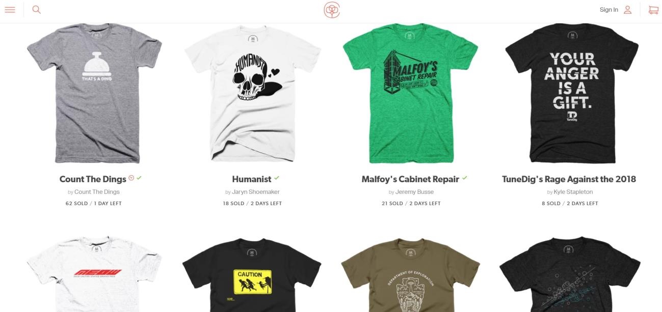
In another example, Cotton Bureau adds near their CTA’s the numbers of days left that a shirt design will be available to buy. Apart from that, they also specify the number of units sold, giving social proof about how in-demand a product is! Great move by them!
2. Keep it Relevant
While it’s tempting to just use the first call to action text that comes to mind (“Sign Up” or “Buy Now”) there are benefits to coming up with more specific, relevant copy for your audience.
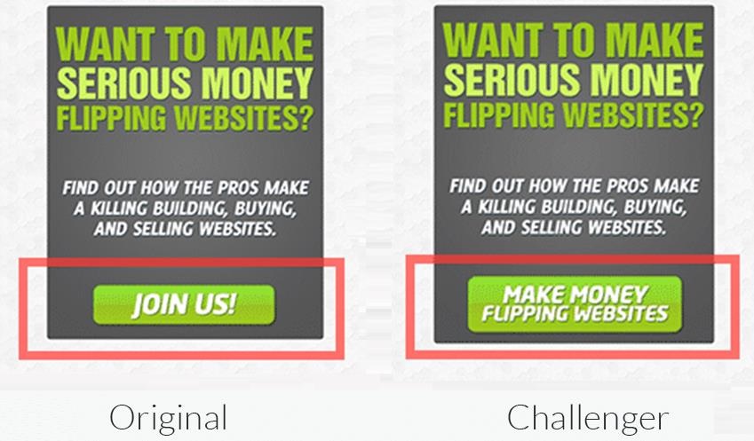
In a case study from Visual Website Optimizer, a website brokering company increased their conversion rates by 33% by changing the text on their CTA button from “Join Us” to the more specific “Make Money Flipping Websites.”
Website brokers EmpireFlippers.com tested the text of the CTA button on their sidebar. The test resulted in increasing clicks on the button by 33.10%. A 33% increase from just changing a couple of words! Truly incredible stuff!
If you want to make your calls to action more relevant, here are some things you should consider:
- What are the benefits your audience can expect from your offer?
In the above example, “Join Us” did not offer any benefits. “Make money,” however, was very specific about what the potential buyer can expect to get.
Other options might include, “Get Your Free Trial Now,” “Claim Your Discount,” or “Reserve Your Spot.” You need to always make it about the customer and what they can gain from the offer.
- How much does your target audience already know about the product you’re selling?
For everyday things such as apparel or household items, you often don’t need to do extra explaining about what a product does.
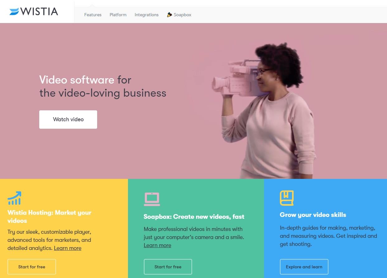
This means you can easily put a CTA without extra information. In this case, a simple “Add to Cart” will do. But if more information is needed, a “Learn More” approach might help. Check out the example below from video marketing app Wistia.
3. Always Be Testing
Finally, it’s important to split-test your calls to action to optimize your conversion rates. Split tests will allow you to see which variations of your CTAs work best.
This ensures that you’re not missing out on potential leads or sales.
Here are some of the CTA elements you can test:
- Button size
- Button color
- Text
- CTA placement
- Elements around the CTA (such as surrounding copy, graphics, or pictures)
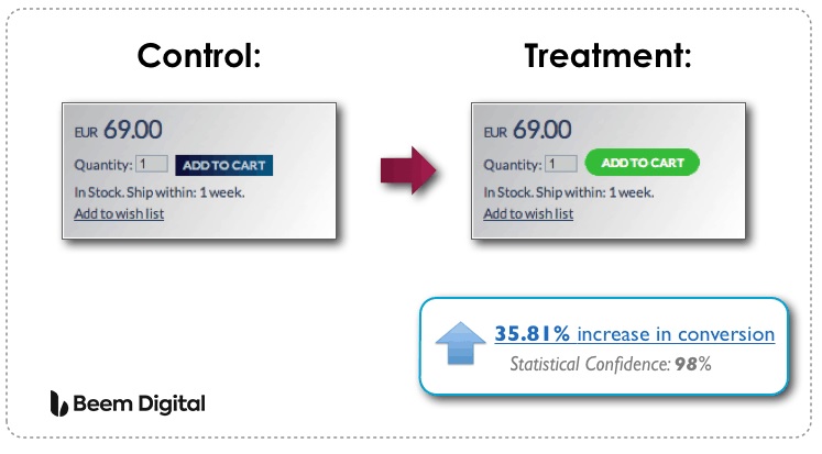
While changing these minor elements seem like nitpicking, the results are often a big deal. A case study from Beem Digital shows that a simple change in the color and shape of the call to action button in product pages was able to increase the conversion rate by 35.81%.
Note that the results of a specific case study might not apply to your business. This is why it’s important to conduct your own split tests to see which changes help you increase your sales and leads.
Powerful Call to Action phrases that you can use:
- Click here for details
- Offer expires…
- Satisfaction guaranteed
- We’d like to hear from you
- Limited availability
- Money back guarantee, no questions asked
- Get it now!
- Act quickly
- Free shipping
- Come in for a free consultation
- Download now
- Click here
- Join now
- Download here
- Start now
- Reserve your spot now
- Come in today
- I urge you to…
- Get a free…
- Talk to an expert

7 Amazing Call to Action Examples
Looking for inspiration in designing a call to action? The examples below can give you a solid place to start:
1. Direct Offer at Beachbody Fitness
The first example is simple and direct to the point. Beachbody Fitness, which sells fitness programs online, has a clear, direct offer in their homepage CTA: “Find Your Program.”
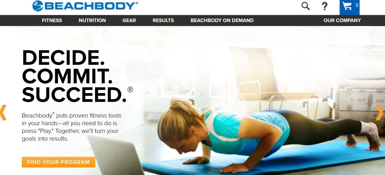
This approach accomplishes two things:
- First, it clearly defines what the visitor can expect to receive (a fitness program).
- Second, it asks for a small, achievable commitment. “Find Your Program” is the next natural step for those who are interested in Beachbody’s programs. By starting out with this small ask, Beachbody makes it easier for the user to say “yes” before they proceed to the next stage in the funnel – a sale.
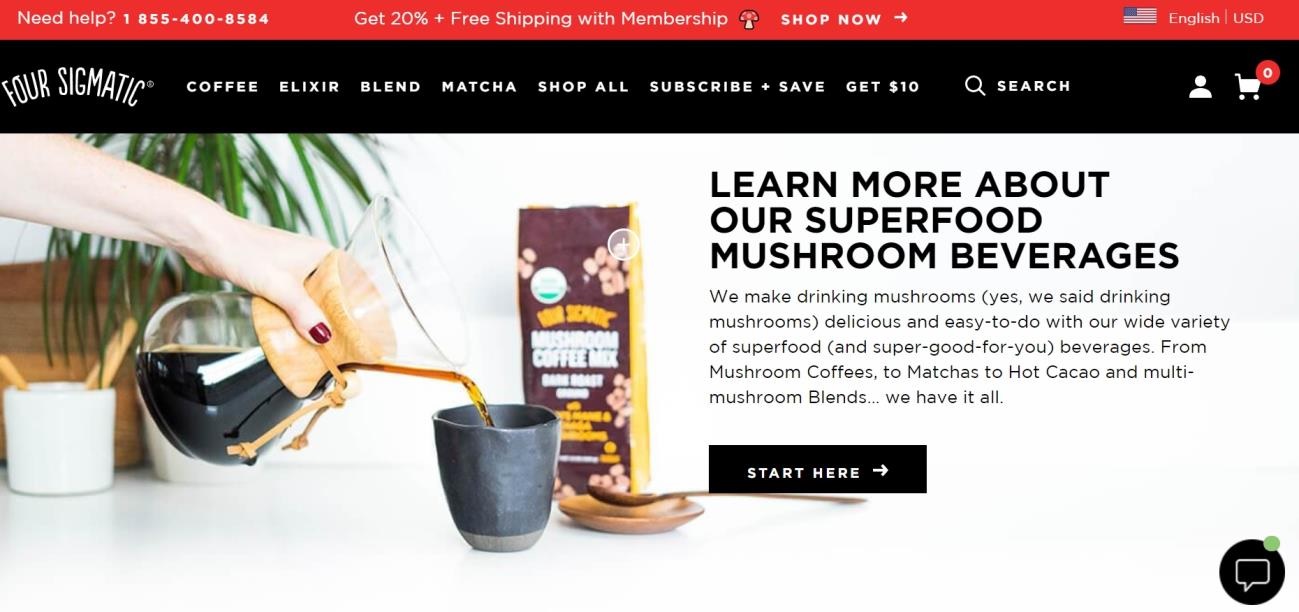
2. Four Sigmatic’s CTAs for Newbies
When people think about coffee or tea, they have specific expectations in mind. Very rarely do they think about mushrooms. But that’s exactly what Four Sigmatic offers: mushroom coffee and tea products.
Since these mushroom beverages are a novel idea, most consumers would need a basic idea of what the products are. That’s where Four Sigmatic’s calls to action come in.
They don’t ask you to “Buy Now” or “Add to Cart” on the homepage. Instead, their first CTAs are “Watch Our Story” and “Get Started” guiding even the most intimidated newbie into their products.
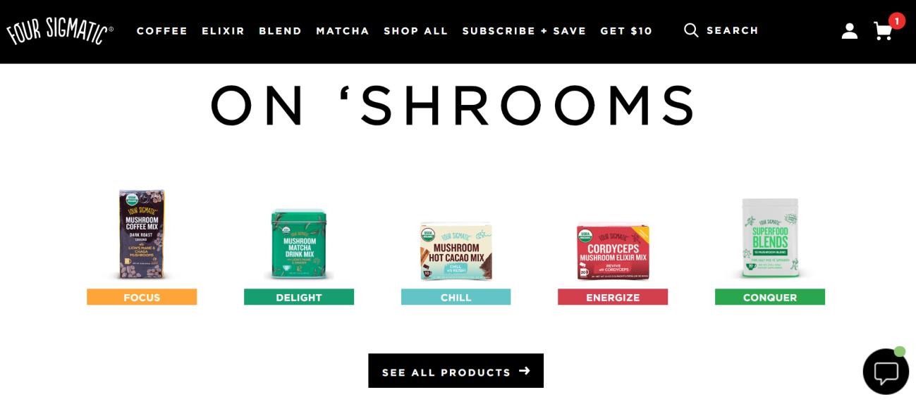
Even when you scroll down to get an overview of their products, the call to action buttons aren’t about the product names – they’re for the benefits that those products offer.
Potential buyers have the option to click on “Focus,” “Delight,” and other benefits. This is so that even if you’re new to the products, you’ll know exactly which part of the online store to visit depending on your needs.
3. Single CTA at Best Made Company
The next example wins a spot on this list for simplicity. What most eCommerce stores tend to do with their product pages is just have the “Buy Now” or “Add to Cart” button in one place.
As users scroll up or down to look at additional information, they lose sight of the button. But Best Made Company’s “Add to Cart” button on their product page stays in place even as you read through the detailed product photos and look at the list of features.
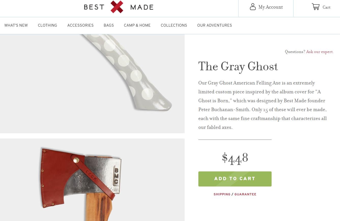
This means that as users are learning more about the product, they can just decide to purchase on the spot without having to search for the “Add to Cart” button.
Remember you want to make it as simple and easy as possible for your customers to purchase your products!
4. Mavi’s Instructive CTA
This example from Mavi Jeans isn’t your typical CTA – it changes between two functions.
The first is when the CTA reads “Select a Size.” This instructs the user to pick their preferred product size, and only after they’ve picked the size will the CTA change to read “Add to Cart.”
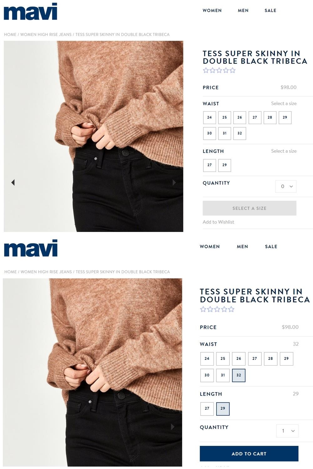
This prevents sizing order mistakes before the user even clicks the “Add to Cart” button. Super cool feature and very effective!
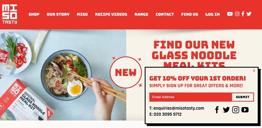
5. Miso Tasty’s Eye-catching CTA
If you need a bold call to action that your website visitors won’t miss, take a cue from Miso Tasty. The first CTA you’ll encounter on their site is a pop-up window asking you to sign up to their mailing list.
This CTA is eyecatching primarily because of the design elements: The typeface is strong and brightly colored, while the pop-up window has a thick dark border with a shadow.
Second, the text above the CTA reads, “Get 10% Off Your First Order,” giving an enticing benefit for potential customers.
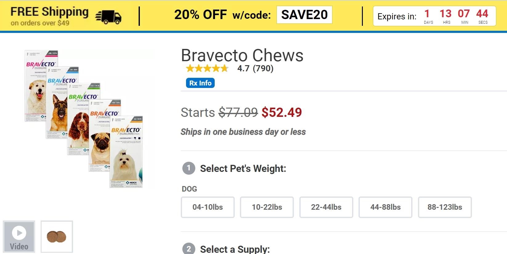
6. 1-800-Pet Meds’ Urgency
Creating a sense of urgency and scarcity is one of the best ways to entice people to click your call to action. 1-800-PetMeds gets it right by having a promo code with a countdown clock on top of their product pages.
As you’re browsing their pet products, you won’t miss the fact that there’s a coupon code you can use and that the coupon code is limited. You can’t be sure that this code or another discount will be available when the countdown is finished.
Because of that, online shoppers are forced to make a decision to purchase as soon as possible. Another genius concept to implement!
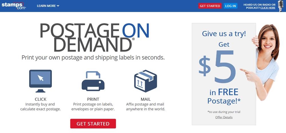
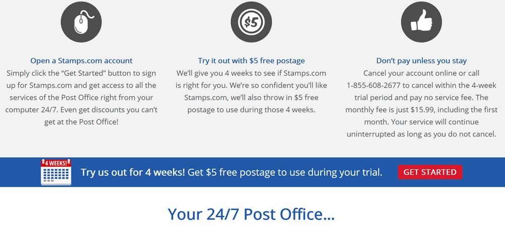
7. Minimalist Stamps.com
In many cases, simple is better. Stamps.com has a single call to action, “Get Started,” repeated throughout their homepage.
More importantly, while most of their design elements are a calm light blue, their CTA button is bright red. This makes the call to action stand out as you browse through the homepage.
The clutter-free design also means that your gaze won’t be distracted by other elements, your eye will be directed straight to the red CTA as you encounter it on the page.
Check more Article:
8 Content Marketing Strategy : You Should KNOW
5 Proven Ways To Increase Website Traffic
20 Affiliate Marketing Strategies To Boost Your Sales
9 Content Framworks : Key Factors For Your Content Creation
Conclusion
Whether your call to action is to get people to sign up to a newsletter, buy a product, or receive a discount code, at the end of the day it’s all in service of one thing — to lead to more sales.
If you take inspiration from the examples above, you’ll end up with CTAs that are compelling, attention-grabbing, and highly clickable.
Just remember: test your calls to action and learn from these tests. This way, your users have no choice but to click.
Consider Following a Course ?
With Lifetime Access ?
We have been the number 1# platform for delivering most demanding course. Becoming Lifetime Member , You will receive all the Premium content For FREE
")
Consider Following a Course ? With Lifetime Access ?
We have been the number 1# platform for delivering most demanding course. Becoming Lifetime Member , You will receive all the Premium content For FREE